Cut Checkout Friction to 12 Form Fields with Conversion Focused Design

Conversion-focused design is the practice of arranging page elements so a single primary action is obvious and easy to complete. Checkout audits from Baymard Institute found that many mobile and desktop ecommerce sites show mediocre or worse checkout UX, and fixing that architecture can lift conversion by a substantial margin on large sites. Some custom-built systems show significant improvement in inbound lead quality after replacing generic templates with purpose-built pages.
TL;DR:
- Removing unnecessary form fields and supporting autofill can lower checkout abandonment by reducing interaction complexity.
- Placing the primary call to action immediately visible above the fold boosts engagement without requiring scrolling.
- Pairing trust signals like badges and guarantees with urgency cues increases the likelihood of visitors acting promptly.
- Stripping navigation and footer links from landing pages helps keep visitors focused on the intended conversion goal.
- Testing microcopy, button size, contrast, and placement can quickly improve conversion rates, especially when focusing on one change at a time.
Table of Contents
- Core principles of conversion-focused design
- Landing page anatomy: the elements that earn conversions
- Visual hierarchy, attention management, and microcopy
- Calls to action and persuasive copy: what to test and why
- Forms and checkout UX: research-backed best practices
- Trust signals: design choices that build credibility
- Testing and measurement: what to track and how to run experiments
- Performance and mobile priorities: Core Web Vitals and conversion impact
- Quick wins checklist: high-ROI changes to try this week
- Applied example and practitioner evidence from Forefront Industries
- Personalization techniques to enhance conversion focus
- Examples/case studies of successful conversion focused design implementations
- Common conversion pitfalls and how to avoid them
- Integrating analytics tools effectively to monitor and improve conversion rates
- User behavior and psychology principles influencing conversion
- Expert perspective: when to invest in design vs. acquisition
- How Forefront Industries builds conversion focused systems
- Primary research and resources used for this article
- Sources
- FAQ
Core principles of conversion-focused design
Conversion-centered design rests on a small set of principles. Each one reduces the distance between a visitor landing on a page and completing the action you want.
Spotlight the goal. Every page should have one job. A homepage that tries to sell, recruit, and educate at once dilutes attention across three competing goals instead of driving one. Test idea: remove every link that doesn’t serve the primary goal and measure the change in completion rate.
Remove friction. Friction is anything that makes a visitor think harder or click more than necessary, extra form fields, unclear next steps, buried pricing. Practitioners treat this as a discipline of subtraction: strip out navigation, footer links, and competing offers on a landing page built for one action.
Build visual hierarchy. Size, color, and placement tell visitors what matters most before they read a word. The primary call to action should be the most visually dominant element on the page, not competing with a hero image or a secondary offer.
State the benefit clearly. Headlines and subheads should answer “what do I get” before “how does it work.” Visitors scan before they read, so the benefit needs to be visible in the first few words.
Keep design consistent. Buttons, colors, and type should behave the same way across every page. Inconsistency forces visitors to relearn the interface, which adds friction even when each page looks fine on its own.
Use urgency and trust together. Urgency without trust reads as manipulation. Trust without urgency reads as passive. Pairing a real deadline or limited availability with a visible trust cue, like a security badge or clear return policy, gives visitors a reason to act now instead of later.
- Spotlight the goal: cut secondary links from high-intent pages and watch completion rate.
- Remove friction: audit every form field and ask if it’s required to complete the transaction.
- Build hierarchy: make the primary CTA the largest, highest-contrast element on the page.
- State the benefit: rewrite headlines to lead with outcome, not feature.
- Stay consistent: standardize button color and label across the funnel.
- Pair urgency with trust: add a real deadline next to a visible guarantee or security mark.
None of these principles work in isolation. A page with perfect hierarchy but no clear benefit still loses visitors, and a page with a compelling benefit buried under ten competing links never gets read. Treat the primary CTA as the page’s single source of truth: every visual and copy decision should increase its relative prominence, not just its own visibility.
Landing page anatomy: the elements that earn conversions
A landing page converts when its structure keeps a visitor’s eyes moving toward one outcome. That structure follows a predictable order, and skipping a step or padding it with unrelated content breaks the sequence.
- Headline and subhead. The headline states the outcome, the subhead adds the specific detail that makes it believable, like a timeframe, price, or mechanism.
- Hero image or video. Visuals should show the product in use or the result achieved, not stock photography of people smiling at laptops.
- Primary CTA above the fold. The main action should be visible without scrolling, repeated again after the benefits section and near the page’s end.
- Benefits, not features. List what the visitor gains, in their language, before describing how the product works.
- Social proof placed near the decision point. Testimonials, client logos, or review counts work best directly above or beside the CTA, not isolated in a separate section visitors may never reach.
- Objection handling. Address the one or two hesitations most visitors have, pricing concerns, setup time, compatibility, right before the final CTA.
- Reduced or removed navigation. A landing page built for a single campaign converts better with a stripped header, since every exit link is a chance to lose the visitor before they act.
An enclosed layout, one with no header navigation and no footer links, keeps visitors inside the funnel you built for them. This matters most for paid traffic, where every click already cost money and a wandering visitor represents a lost return. For organic or brand pages where exploration is expected, full navigation still makes sense, since the goal there is different from a single-campaign landing page.
Visual hierarchy, attention management, and microcopy
Visitors decide where to look before they decide what to read. Size, contrast, and whitespace direct that decision, and getting them wrong buries your CTA under visual noise.
- Make the primary CTA button at least 20% larger than secondary buttons on the same page.
- Use a color for the CTA that appears nowhere else on the page, so it reads as the one actionable element.
- Leave generous whitespace around the CTA, isolation draws the eye faster than decoration does.
- Keep contrast between CTA text and button background high enough to meet WCAG AA guidelines, a common failure point on branded buttons with light text on light backgrounds.
- Limit each section to one visual focal point, competing focal points split attention and slow decision-making.
Microcopy carries as much weight as layout. A button that says “Submit” tells a visitor nothing about what happens next, while “Get My Free Quote” or “Start My 14-Day Trial” states the outcome directly. Inline help text under a form field, like “We’ll never share your email,” addresses hesitation at the exact moment it appears instead of burying it in a footer link.
Pro Tip: Read every CTA label out loud. If it doesn’t answer “what do I get,” rewrite it.
Calls to action and persuasive copy: what to test and why
A CTA has three jobs: state the action, state the benefit, and create a reason to act now. Most underperforming buttons do only the first.
- Clarity: use a verb plus a specific outcome (“Get My Estimate” beats “Submit”).
- Size and placement: the button should be reachable without scrolling and visible again at natural decision points further down the page.
- Urgency where it’s true: only reference limited time or availability when it’s accurate, false urgency erodes the trust you need later in the funnel.
Micro-commitment copy works by asking for a small yes before the big one. A two-step form that starts with “See My Price” before asking for contact details converts more visitors than a single long form asking for everything up front, because the first step feels low-risk.
Worth testing, roughly in order of expected impact:
- CTA button copy: generic verb versus benefit-driven phrase.
- Button color and contrast against the surrounding page.
- Number of CTAs on the page: one dominant action versus multiple competing offers.
- Placement: above the fold only versus repeated at each scroll depth.
Copy tests tend to move the needle fastest because they’re cheap to run and isolate one variable at a time. Layout tests take longer to build but often produce larger gains when the original layout buried the CTA entirely.
Forms and checkout UX: research-backed best practices
Checkout is where conversion-focused design earns or loses its return, and it’s also the stage with the most independent research behind it. Baymard’s checkout UX guidance recommends guest checkout prominence, removing distractions, showing full costs early, and minimizing form complexity as the highest-ROI priorities.
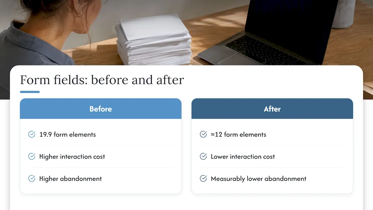
Optimized checkout flows average 12 form elements, compared with an industry standard of 19.9, according to Baymard Institute. Every field beyond what’s required to complete the transaction adds interaction cost, and interaction cost is the single biggest predictor of abandonment at checkout.
- Offer guest checkout as the default path, account creation as an optional step afterward.
- Hide secondary fields like Address Line 2 behind a link instead of showing them by default.
- Use a single full-name field instead of separate first and last name fields where possible.
- Support autofill and set intelligent defaults, like country based on IP, to cut typing.
- Validate fields inline, as the visitor types, rather than only after form submission.
- Preserve all entered input after a validation error so visitors never re-type an entire form.
- Display multiple payment options, including digital wallets, without forcing a page reload.
Fixing severe checkout friction produces revenue gains large enough to justify the engineering time, which is why framing these fixes as revenue recovery rather than design polish tends to win the budget conversation faster.
Trust signals: design choices that build credibility
Visitors decide whether to trust a page before they decide whether to buy from it. Research from ACM’s study on website design and trust found that professional visual design and trust-inducing components measurably increase purchase likelihood, with specific design elements grouping into distinct trust dimensions readers respond to.
- Place client logos, review scores, or third-party badges near the CTA, not in an isolated trust section visitors may skip.
- Show security badges and clear return or refund policies directly on checkout forms, where hesitation peaks.
- Use real customer photos and specific outcomes in testimonials rather than generic praise.
- Keep policy links (privacy, returns, terms) visible but small, present without competing with the primary action.
- Test trust elements one at a time, adding a badge and a guarantee in the same test makes it impossible to know which one moved the number.
A separate study on trust and website conversion found trust in a site’s design accounted for roughly 57.1% of variability in conversion within its sample, a reminder that trust cues aren’t decoration, they’re functional parts of the funnel.
Testing and measurement: what to track and how to run experiments
A/B testing turns design opinions into evidence. Running tests without a clear framework wastes traffic on changes too small to matter.
- Track conversion rate as the primary KPI, alongside revenue per visitor and micro-conversions like form starts or add-to-cart events.
- Estimate required sample size before launching, a test that ends before reaching statistical confidence produces a result you can’t trust.
- Prioritize tests by impact, confidence, and effort, a framework that ranks a high-impact, low-effort headline change above a low-impact, high-effort redesign.
- Start with checkout and CTA tests first, since these sit closest to the transaction and tend to produce the clearest signal.
- Use qualitative research, like session recordings or short user interviews, when quantitative data shows a drop-off but doesn’t explain why.
Testing works best as a continuous cycle rather than a one-time project. A single successful test rarely compounds into lasting growth on its own, but a steady cadence of small, measured changes does.
Performance and mobile priorities: Core Web Vitals and conversion impact
A page can follow every design principle in this guide and still convert poorly if it loads slowly or shifts under a visitor’s thumb. Core Web Vitals guidance treats these metrics as a gating signal: fixing a “poor” score to “good” removes a penalty that no amount of copywriting can offset.
- LCP (Largest Contentful Paint) measures how long the main content takes to load, slow LCP means visitors bounce before they see your CTA at all.
- CLS (Cumulative Layout Shift) measures visual stability, a page that jumps while loading causes mis-clicks on the wrong button.
- INP (Interaction to Next Paint) measures how quickly the page responds to a tap or click, slow response feels broken even when the page technically works.
Fix them in that order, LCP first, then CLS, then INP, since LCP failures tend to cause the most visible damage and the most lost visitors before any design decision even gets seen. On mobile specifically, large hero images and third-party scripts are the most common root cause of slow LCP. Balancing performance with design means compressing images and deferring non-critical scripts rather than stripping out the visual elements that build trust.
Quick wins checklist: high-ROI changes to try this week
Not every improvement requires a redesign. These changes can often ship within days and start producing signal within a single testing cycle.
- Remove non-essential navigation links from top landing pages.
- Increase CTA button size and contrast against the page background.
- Rewrite CTA copy to state a specific outcome instead of a generic verb.
- Move social proof directly above the primary CTA.
- Cut form fields down to only what’s required to complete the transaction.
- Enable guest checkout if it isn’t already the default.
- Preserve form input after validation errors.
- Compress hero images to improve LCP.
- Add inline validation to long forms.
- Display a security badge or guarantee near the final CTA.
Applied example and practitioner evidence from Forefront Industries
Some companies build custom-coded sites rather than starting from templates, which means every layout decision, from hero structure to form field count, is built around a client’s actual funnel instead of a generic pattern. Pairing custom front-end design with CRM and lifecycle automation on platforms like Salesforce Marketing Cloud can help ensure that a conversion gain on the page doesn’t get lost downstream in a disconnected follow-up process. That combination, design plus system, tends to hold up longer than a one-time page redesign.
Personalization techniques to enhance conversion focus
Personalization works when it reduces effort rather than just adding novelty. A returning visitor who sees their previously viewed product, or a form that pre-fills known information, experiences less friction than one who starts from zero every visit.
The most reliable personalization tactics include showing location-based offers or availability, adjusting headline copy based on traffic source (a visitor from a “pricing” search sees pricing first), and using CRM data to tailor follow-up sequences after a form submission rather than sending one generic email to everyone. Dynamic content blocks that swap based on industry or company size let a single landing page speak directly to different segments without building a separate page for each one.
The risk with personalization is over-engineering it before the basics are solid. A page with broken hierarchy and no clear CTA won’t convert better just because it shows a visitor’s first name in the headline. Get the core principles working first, then layer personalization on top to sharpen what’s already converting.
Examples/case studies of successful conversion focused design implementations
The clearest examples of conversion-focused design share a common trait: they removed something rather than adding it. A checkout flow cut from 19.9 form elements down to around 12, in line with Baymard’s benchmark data, reduces interaction cost enough to measurably lower abandonment on its own, without any new design elements added.
Service businesses tend to see the clearest gains from consultation-focused landing pages that strip navigation and lead with a single booking action. A landing page built around one outcome, requesting a quote, booking a call, starting a trial, consistently outperforms a multi-purpose homepage asked to do the same job, because visitors never have to guess what to do next.
The pattern holds across industries: pages that commit to one action, supported by clear benefits and visible trust cues, outperform pages that try to serve every visitor’s possible intent at once. The specific design details change by industry, but the underlying discipline, subtraction over addition, doesn’t.
Common conversion pitfalls and how to avoid them
The most common mistake is treating conversion design as a decoration problem instead of a friction problem. Teams redesign a hero image or swap a color palette while the actual blocker, a ten-field form or a five-second load time, goes untouched.
A close second is testing too many variables at once. Changing headline, image, and CTA color in the same test makes the result impossible to interpret, even when the overall number moves. A third pitfall is adding urgency or scarcity messaging that isn’t true, which damages trust once visitors notice the same “limited time” offer has run for months.
Overloading a page with competing CTAs is another frequent failure. A page that asks visitors to “Buy Now,” “Learn More,” and “Subscribe” in the same viewport forces a decision the visitor didn’t come to make, and indecision usually ends in leaving. The fix in every case is the same: identify the one friction point causing the most drop-off, fix that first, and resist the urge to polish everything simultaneously.
Integrating analytics tools effectively to monitor and improve conversion rates
Analytics only improve conversion when they’re set up to answer a specific question, not just to collect data. Before adding a tool, define what decision the data needs to inform: where visitors drop off in a funnel, which traffic source converts best, or which form field causes the most abandonment.
Event tracking on micro-conversions, form starts, button clicks, scroll depth, matters more than raw pageviews for diagnosing friction, since pageviews alone don’t show where a visitor gave up. Session recording and heatmap tools complement quantitative dashboards by showing the behavior behind a drop in numbers, which is useful when a funnel report shows a problem but not its cause.
The most effective setups tie analytics directly to the CRM, so a conversion event on the page connects to what happens to that lead afterward. A page that generates high form-fill volume but low close rate downstream isn’t actually a conversion win, it’s a lead-quality problem that only shows up when analytics and CRM data are connected rather than viewed in isolation.
User behavior and psychology principles influencing conversion
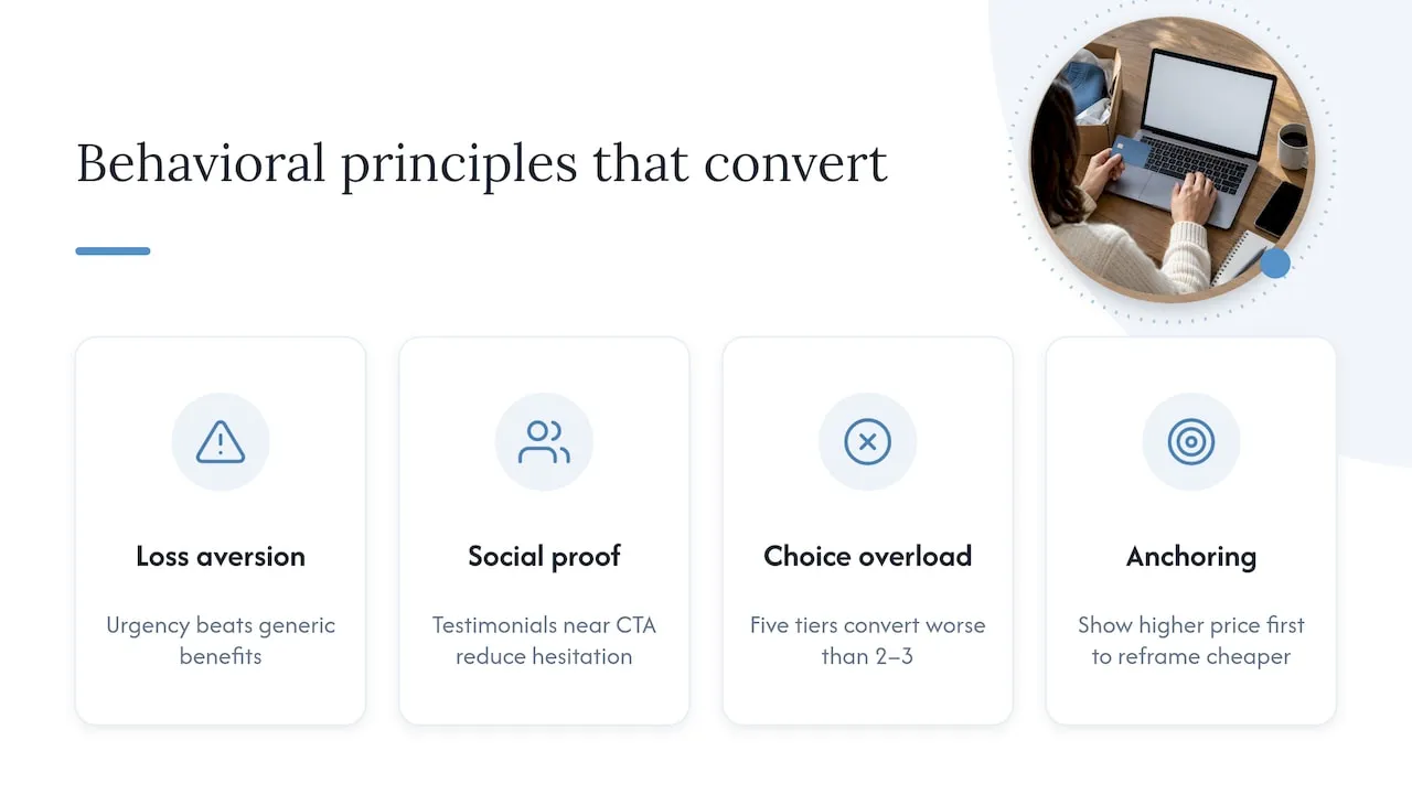
Visitors make decisions faster than most page designs account for, and several well-documented behavioral patterns explain why certain layouts consistently outperform others. Loss aversion means visitors respond more strongly to the fear of missing a deadline or limited stock than to the promise of a reward of equal size, which is why honest urgency messaging tends to outperform generic benefit statements.
Social proof works because visitors use other people’s behavior as a shortcut for their own decision when they’re uncertain, which explains why testimonials placed near a CTA reduce hesitation more than the same testimonials buried on a separate page. The paradox of choice shows up when a page offers too many options at once, visitors facing five pricing tiers often convert at a lower rate than visitors facing two or three, because more options increase the cognitive cost of deciding.
Anchoring affects how visitors perceive price: showing a higher-priced option first makes a subsequent option look more reasonable by comparison. None of these principles work as a trick to manipulate visitors, they work because they reduce the mental effort required to decide, and reduced effort is the throughline connecting every principle in this guide.
Expert perspective: when to invest in design vs. acquisition
Fix severe UX and performance failures before spending another dollar on traffic. A slow, confusing checkout wastes paid clicks the same way a leaking pipe wastes water regardless of how much you pour in. Once the page converts cleanly, optimize it further, then scale acquisition. A custom build is justified when a template can’t support the workflow you need; otherwise, test incrementally and estimate ROI from your current traffic volume before committing to a larger spend.
- Jeremy
How Forefront Industries builds conversion focused systems
Most of what separates a converting page from one that quietly leaks leads is architecture, not aesthetics: field counts, load times, and whether the CTA is the one thing on the page fighting for attention. Some companies build fully custom-coded websites rather than assembling template-based pages, which means the principles in this guide can be built into the page’s structure from the start instead of bolted on after launch.
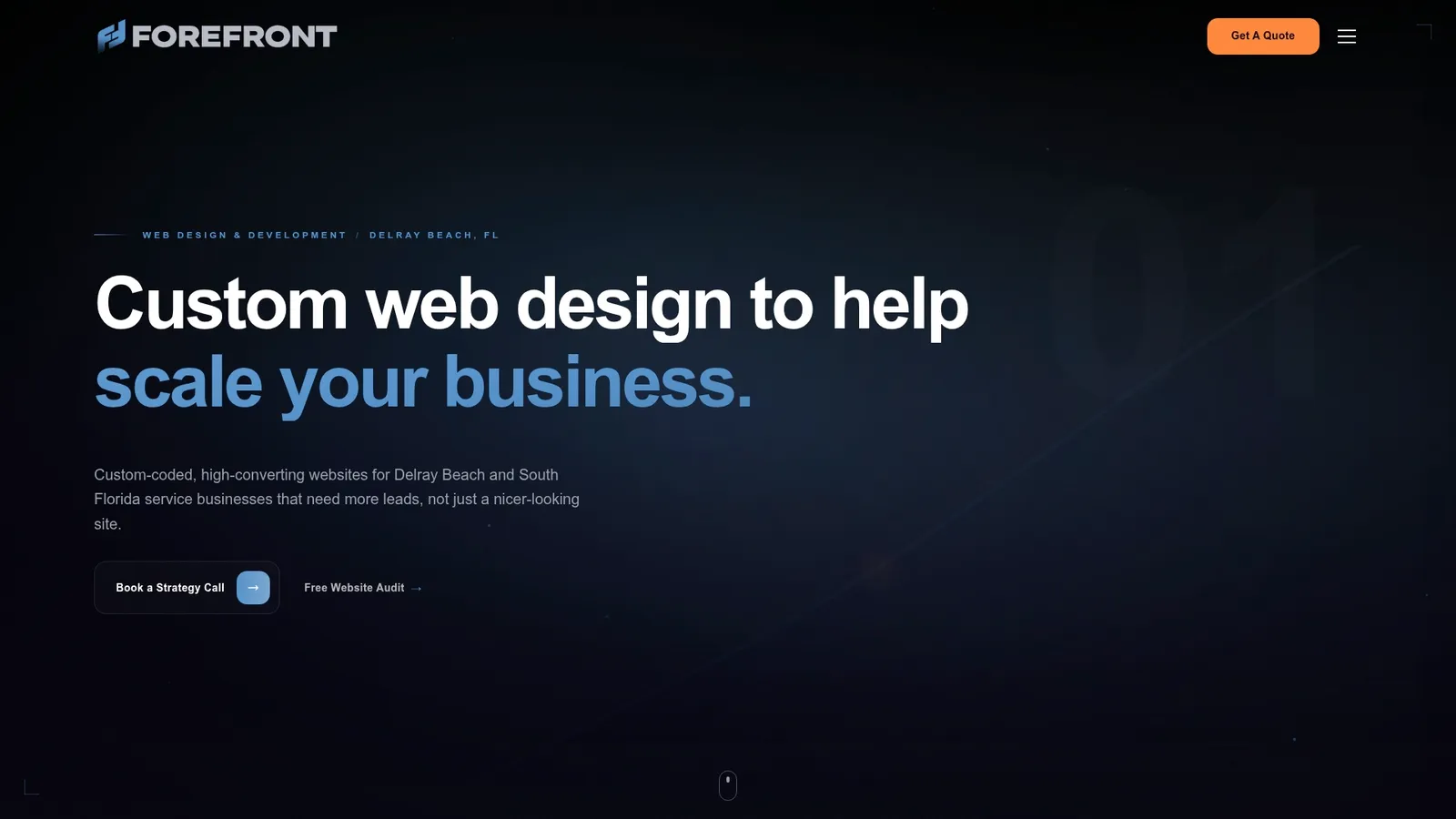
Forefront’s services cover the full stack this guide touches: Web Design & Development for the page itself, Email & CRM Development for what happens after a visitor converts, and AI Automation & Consulting for routing and qualifying leads without manual work. Ongoing Website Maintenance, including the Managed Hosting, Webmaster, and Performance Plus plans, keeps performance and Core Web Vitals in good standing after launch rather than letting them decay. Visit the services overview to see how a custom build compares with your current setup, or review website maintenance options if performance is your immediate concern.
Primary research and resources used for this article
This guide draws on Baymard Institute’s checkout UX benchmarks and checkout flow optimization guidance for form and interaction-cost data, Core Web Vitals guidance for performance prioritization, ACM’s study on design and trust for trust-component research, and a study on trust and conversion for the predictive weight of trust on purchase behavior. For service businesses building consultation-focused pages, practical booking-page patterns and consultation page tips offer further reading, along with conversion-focused site anatomy.
Sources
- Checkout UX Best Practices 2025 – Baymard Institute
- Core Web Vitals and SEO: Do They Affect Google Rankings?
- The impact of website design on users’ trust - ACM
FAQ
What are the 7 principles of conversion-centered design?
Definitions vary across sources, but common versions include a clear goal focus, minimal navigation, a single dominant CTA, strong visual hierarchy, trust signals, clear benefit statements, and urgency. The exact count and labels differ by framework, though most converge on prioritizing one action per page and removing friction around it.
What does “conversion focused” mean?
It means every design and copy decision on a page is made to move visitors toward one specific action, like a purchase, signup, or form submission. Elements that don’t support that action, extra navigation, unrelated offers, are removed or minimized rather than added for variety.
What are the 5 stages of user-centered design?
User-centered design typically moves through research, analysis, design, prototyping, and testing, then repeats as a cycle rather than a one-time sequence. Each stage feeds the next: research informs what to design, and testing reveals what to revisit.
What is an example of a conversion strategy?
A common strategy is reducing a checkout form from the industry-standard 19.9 fields down to the optimized average of 12, cutting interaction cost enough to lower abandonment, according to Baymard Institute. Another is placing social proof directly beside the primary CTA instead of in a separate section, so trust and action appear in the same moment.