Build Accessible Multi Step Forms That Plug Into Your CRM

A multi-step form splits a long data-collection flow into short, sequential screens instead of one long page, and it works: field tutorials and industry write-ups report typical completion-rate gains of 20 to 30 percent once a long form gets broken into steps. Use one whenever you’re collecting more than five or six fields, asking for sensitive information, or gathering data across distinct topics like contact info, project scope, and budget.
TL;DR:
- Breaking long forms into three to five fields per step significantly reduces abandonment and improves completion rates by 20 to 30 percent.
- Use a progress bar or numbered stepper with clear labels and validate each step immediately to enhance user confidence and data accuracy.
- Implement accessibility features such as semantic
<fieldset>elements, focus management, and ARIA live regions to support screen reader users.- Keep forms focused on longer, high-stakes flows with more than six fields, multiple topics, or sensitive data, avoiding multi-step structure for simple, quick requests.
- Integrate form data directly with CRM systems and automation platforms to improve lead quality and streamline follow-up workflows.
Table of Contents
- Why Multi-Step Forms Improve Completion Rates
- Best Practices for Designing Multi-Step Forms
- Accessibility and Progressive Disclosure in Multi-Step Forms
- How to Build a Reliable Multi-Step Form
- Testing and Optimizing Multi-Step Form Performance
- When to Use Multi-Step Forms (And When Not To)
- Forefront Industries’ Approach to High-Converting Forms
- Common Multi-Step Form Mistakes (And Fast Fixes)
- Ready to Turn Your Form Into a Lead Engine?
- Sources
Why Multi-Step Forms Improve Completion Rates
A single long form asks the brain to process everything at once: fifteen fields, three field types, two dropdowns, and a file upload, all visible at the same time. That’s cognitive overload, and it’s the single biggest reason visitors abandon forms before finishing. Multi-step forms fix this by showing only what matters right now.
The psychology behind the lift is straightforward. Once someone completes step one, they’ve made a small investment, and people don’t like abandoning progress they’ve already made. Combine that with a visible progress bar and the effect compounds: users can see the finish line, which makes the remaining effort feel bounded rather than open-ended.
The operational upside matters just as much as the psychological one. Per-step validation catches errors immediately, before a user has typed twenty more fields worth of data on top of a mistake, and staged saves mean a dropped connection or an accidental tab close doesn’t erase everything.
Typical completion lift: Breaking a long form into steps produces roughly 20 to 30 percent higher completion than the single-page equivalent, according to multiple industry tutorials.
The measurable benefits break down into three categories:
- Lower abandonment: shorter per-screen commitment keeps users moving instead of bouncing.
- Cleaner data: per-step validation catches typos and missing fields before they compound.
- Better lead quality: staged forms let you front-load qualifying questions and de-prioritize unqualified traffic early.
Best Practices for Designing Multi-Step Forms
Good multi-step form design comes down to a handful of rules that are easy to state and easy to skip under deadline pressure.
Keep each step to three to five inputs, grouped by a single micro-topic. A step titled “Contact Info” that also asks for company size and referral source isn’t really about contact info anymore, and users notice the mismatch even if they can’t name it.
Start with an easy win. Ask for a name or a simple choice first, not a Social Security number or payment details. Sensitive or high-friction fields belong later in the flow, once the user has already invested a step or two and is less likely to bail.
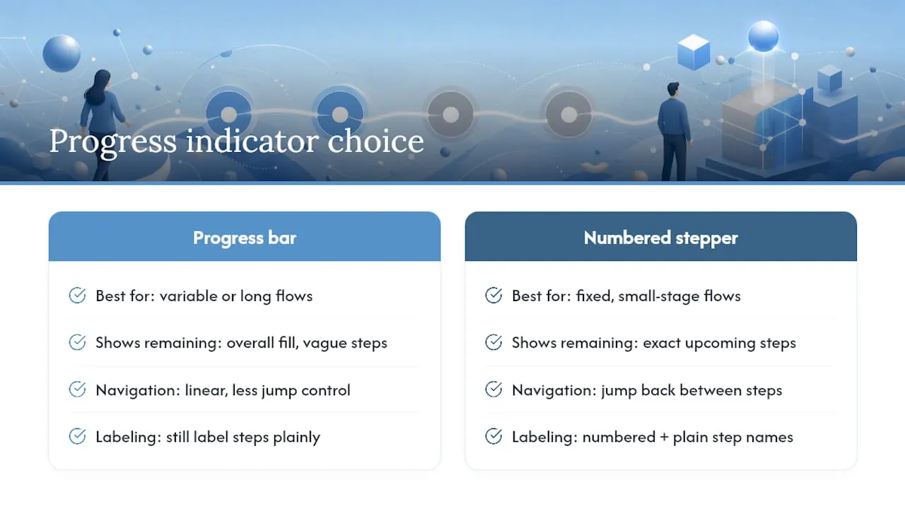
Choose your progress indicator deliberately. A progress bar (a filling horizontal bar) suits forms where the total step count feels variable or long. A stepper (numbered, labeled steps like “1. Contact → 2. Project → 3. Budget”) suits forms with a fixed, small number of stages, because it lets users see exactly what’s coming and jump back if needed. Either way, label every step in plain language; “Step 2 of 4: Project Details” beats a bare “Step 2.”
Validation and help text deserve the same care as the questions themselves. Trauma-informed guidance from the U.S. Web Design System recommends calm, non-accusatory error messaging and a save-and-resume option for forms that touch emotionally difficult territory, like medical intake or financial hardship applications. “That doesn’t look like a valid phone number” reads very differently than “Invalid input.”
Pro Tip: Test your step order by asking someone unfamiliar with the form to complete it out loud. If they hesitate or ask “why do you need this now?” at any point, that field is in the wrong step.
Accessibility and Progressive Disclosure in Multi-Step Forms
Progressive disclosure means showing only the questions relevant to the user’s current answers, hiding the rest until they’re needed. The U.S. Web Design System recommends this pattern specifically when a form collects more than basic contact information, especially anything sensitive, financial, or health-related, guiding users from simple questions to harder ones so they stay focused instead of overwhelmed.
Accessibility isn’t optional polish here, it’s structural. A few patterns matter more than the rest:
- Use semantic
<fieldset>and<legend>elements for each step, so assistive technology announces the step’s purpose. - Manage focus programmatically on every step change, moving it to the new heading or first field.
- Announce step transitions with an
aria-liveregion so screen reader users know navigation happened. - Never rely on color alone to mark required fields or errors; pair color with text and an icon.
Pattern libraries like PatternFly distinguish single-level conditional fields (one parent control shows or hides one dependent field) from hierarchical nested disclosures, where revealing one field exposes a whole sub-branch of the form. Mixing these patterns without a clear parent-child relationship confuses both sighted users and screen readers, since the visual hierarchy stops matching the logical one. Pick the simplest pattern that does the job. A single checkbox revealing one extra field doesn’t need the same architecture as a multi-branch eligibility questionnaire.
How to Build a Reliable Multi-Step Form
The most durable implementation pattern, whether you’re hand-coding it or using a framework, follows the same core logic:
- Wrap every step in one
<form>element. Use separate<fieldset>blocks for each step rather than separate<form>tags. This is what lets hidden inputs from earlier steps submit correctly alongside the current step’s visible fields, without complicated state-syncing between components. - Make navigation buttons
type="button", nottype="submit". Only the final step’s submit button should actually submit the form; “Next” and “Back” just toggle which fieldset is visible. - Gate forward navigation with per-step validation. Call the browser’s
checkValidity()on the current step’s fields before advancing, and replace terse native tooltips with clearer custom messages. - Manage focus and update the progress indicator on every step change. Move focus to the new step’s heading, and update the aria-live region so assistive technology and sighted users stay in sync.
- Build a final review step. Recreate a compact summary (label paired with value) with edit links that jump back to the relevant step, giving users a chance to catch mistakes before submitting.
- Persist progress. For short sessions,
sessionStorageis usually enough. For longer, multi-day forms, like a detailed application or a project intake, implement server-side partial saves so users can resume from a link or login rather than losing everything.
For a hand-rolled build, vanilla JavaScript and CSS with a single form and a few dozen lines of show/hide logic covers most marketing and lead-gen use cases. For larger React applications with complex branching, a headless stepper library (like react-multistep) handles step state and validation gating through hooks, leaving you to build only the visual layer.
Pro Tip: Build the review step first, even before the other steps look finished. It forces you to decide, early, exactly what data each step needs to produce.
Testing and Optimizing Multi-Step Form Performance
You can’t improve what you don’t measure, and multi-step forms give you far more measurement points than a single-page form ever could.
Track completion rate at each individual step, not just the overall funnel conversion. A form that loses 40% of users between step one and step two is a different problem than one that loses users at the final payment step. Also watch time spent per step and abandonment rate by device, since mobile behavior often diverges sharply from desktop.
Worthwhile experiments to run once you have baseline data:
- Simplify or shorten the first step to reduce initial friction.
- Test three fields per step against five to see where the completion curve breaks.
- Compare a progress bar against a numbered stepper for the same form.
- Offer a visible “save and finish later” link and measure whether it lifts completion or return rate.
Pair the quantitative data with qualitative signals. A short micro-survey on the abandonment page (“What stopped you from finishing?”) and session replay tools often reveal the why behind a drop-off that raw funnel numbers can’t explain. Prioritize experiments by traffic volume first. A change to a low-traffic form won’t reach significance for months, no matter how promising the idea.
When to Use Multi-Step Forms (And When Not To)
Multi-step forms earn their complexity on longer, higher-stakes flows: account registrations, job applications, detailed intake forms for service businesses, payment and checkout flows, and multi-section surveys. Staged flows also work well for qualifying inbound leads before routing them, letting you sort serious prospects from casual browsers within the first step or two.
Single-step wins when the ask is genuinely small: an email capture for a newsletter, a one-field quote request, or anything a user should finish in under fifteen seconds. Adding steps to a short form just adds friction for no benefit.
| Signal | Favors multi-step | Favors single-step |
|---|---|---|
| Field count | 6 or more | 5 or fewer |
| Data sensitivity | Financial, medical, personal | Name and email only |
| Topic variety | Multiple distinct topics | One topic |
| Mobile traffic share | High (shorter screens help) | Low |
Run through this quick checklist before you decide: does the form cross six fields, touch sensitive data, or span more than one topic? Two or more “yes” answers point toward multi-step.
Forefront Industries’ Approach to High-Converting Forms
Long, well-structured forms are only half the equation. What happens to that data after submission determines whether the form actually produces revenue. Custom-coded front ends can be paired directly with enterprise CRM and lifecycle automation on platforms like Salesforce Marketing Cloud and Braze, so a multi-step intake form doesn’t just collect data, it can trigger the right lifecycle sequence the moment someone submits step one.
That wiring is where the real gain shows up.
Bring in an agency-level partner when your form needs:
- Integration with an enterprise CRM rather than a basic email capture tool.
- Lead routing logic based on answers collected across multiple steps.
- Custom validation or conditional branching too complex for a template builder.
Common Multi-Step Form Mistakes (And Fast Fixes)
The same handful of mistakes show up across most broken multi-step forms, regardless of industry or platform. Overloaded steps top the list: cramming eight fields into a step because “it’s still one step” defeats the entire purpose of breaking the form apart. Hidden validation errors run a close second, where a user submits a step, sees nothing happen, and has no idea a field above the fold failed silently. Broken mobile layouts round out the trio, usually because progress indicators or navigation buttons were designed on a wide desktop viewport and never tested at 375 pixels.
The fixes are just as short. Cap steps at three to five fields. Surface inline validation the instant a field fails, not just on submit. Add a review step so users catch their own mistakes before you do. Build save-and-resume into anything longer than three steps. None of this requires new technology, just discipline about what ships.
- Jeremy
Ready to Turn Your Form Into a Lead Engine?
Most agencies hand you a template builder and call it a day. A full pipeline can be built instead, with a custom-coded multi-step form wired directly into your CRM and lifecycle automation, so every submission triggers the right follow-up sequence automatically rather than sitting in an inbox waiting for someone to notice it.
Before reaching out, gather three things: your current form’s completion rate (if you’re tracking it), a list of what’s actually going wrong (drop-off point, broken mobile layout, no CRM sync), and a rough sense of your goals for the rebuild. That context lets us scope the work accurately from the first conversation.
Forefront Industries’ custom web development work covers exactly this: multi-step form architecture, per-step validation, save/resume logic, and direct integration into platforms like Salesforce Marketing Cloud or Braze. If your form is losing leads to bad UX or a CRM that never gets the data it needs, start a conversation with Forefront Industries about rebuilding it properly.
Sources
The design and implementation guidance in this article draws on a handful of sources worth bookmarking directly: